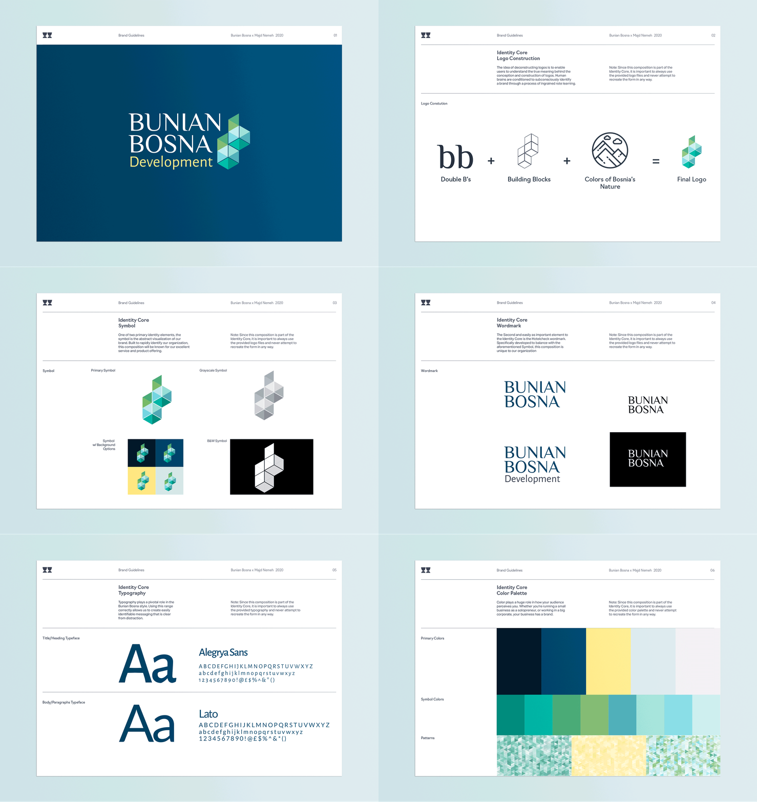
Bunian Bosna is a leading property development group based in Travnik, Bosnia & Herzegovina. Their unparalleled local market expertise has made them a household name in the industry. As next-generation real estate developers, they believe in living where you want to be – not where you have to be. Bunian wants the people of Bosnia & Herzegovina to see them as allies, not agents, full of optimism and energy, not corporate condescension. So we set out to work to bring their vision to life. We needed to create a brand and style that would captivate investors and reflect the style and design of the property development across various touchpoints.

The First order of business. Taking a cue from the name 'Bunian,' which translates to structures / buildings, it's only fitting that the symbol included geometric shapes. The symbol is not only a reference to the two B’s in Bunian Bosna, but it also consists of four 3D adjacent cubes/building blocks. The cubes were further split in half for the coloured version, creating triangles and allowing us to honour Bosnia & Herzegovina’s beautiful colours of their 20,000+-year-old rainforest and its endless waterfalls. We paired the colours of the symbol with a softer blue & yellow background that created a soft dynamic contrast and paid homage to the flag of Bosnia & Herzegovina. We paired it with a capitalized serif font that strikes the eye as stylish and modern, similar to standard fonts in that it is functional and elegant.
The end product feels like the name and logo finally allude to growing possibilities in Bosnia & Herzegovina's housing sector.


